When it comes to digital marketing, good landing page design isn’t just about aesthetics—it’s about performance. Your landing page has one job: to convert. Whether that’s collecting emails, selling a product, or booking a call, every pixel on the page should move visitors closer to taking that next step. And in 2025, a well-designed landing page also needs to rank on Google, which means SEO matters just as much as design.
But beyond the mechanics and SEO, the psychology of your landing page is what ultimately drives conversions. A well-optimized design taps into human behavior—reducing friction, building trust, and guiding attention to the right places. When users land on your page, they’re subconsciously asking, “Is this worth my time?” And your design is answering that question before they read a single word.
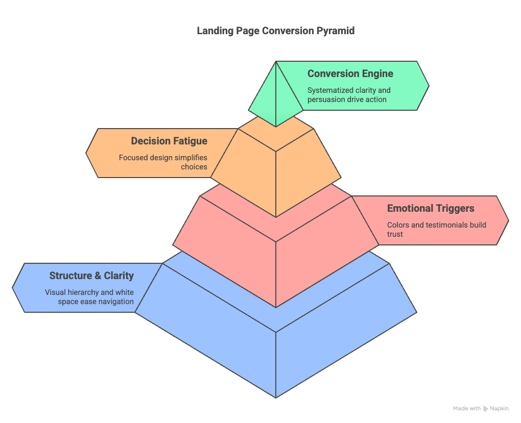
Psychologically, people are drawn to structure and clarity. A chaotic layout or unclear CTA overwhelms the brain. The best landing pages use visual hierarchy to create a sense of ease, leading the eye naturally from one section to the next. White space isn’t just design fluff—it gives the mind room to breathe, making each message land harder.
Emotional triggers also play a major role. Colors, testimonials, and even font choices influence how safe and confident someone feels while scrolling. Blue suggests trust, red can create urgency, and social proof reduces anxiety by showing others have taken this step before. These subtle signals all add up.
And finally, decision fatigue is real. Too many options paralyze users. A clean, focused landing page helps visitors make a yes-or-no decision quickly. When you systematize clarity and persuasion, you don’t just have a landing page—you have a conversion engine.
Let’s break down exactly what makes a good landing page design—from structure and copy to search visibility and conversion psychology.
Crafting a URL With the Primary Keyword
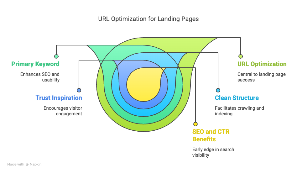
The first step to good landing page design starts with the URL. A short, clean URL that includes the primary keyword helps both SEO and usability. Search engines reward clarity, and so do human brains. If your landing page is about “AI lead generation tools,” your URL should look something like yourdomain.com/ai-lead-generation—not yourdomain.com/1234-xF9toolz
From a technical standpoint, clean URLs are easier to crawl, index, and share. They also inspire trust. Visitors are more likely to click on a link that looks intentional and relevant. Keyword-rich URLs are one of those small tweaks that compound over time.
This subtle optimization may seem minor, but when combined with other elements, it can give your page an early edge in both SEO rankings and click-through rates. It’s an easy win that sets the foundation for search visibility.
Lead With a Recognizable Company Logo

Branding reinforces trust. One of the first things a visitor looks for—consciously or unconsciously—is a logo. A prominently placed logo at the top left of your page reassures them they’re in the right place. This isn’t just good branding—it’s good UX.
People skim quickly. If they can’t tell who you are in 2–3 seconds, you’ve lost them. A good logo, paired with a consistent brand color palette, helps anchor the rest of the page.
Beyond brand recognition, a clear logo placement adds professionalism and credibility. Especially if you’re driving paid traffic, this quick visual cue can keep bounce rates low and user trust high.
Use an SEO-Optimized Headline and Subheadline
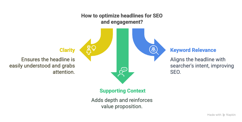
Your headline needs to hit two birds with one stone: clarity and keyword relevance. An effective headline grabs attention and aligns with the searcher’s intent. If someone Googles “best CRM for coaches,” your landing page should include that phrase (or close variations) in the headline or subheadline.
Subheadlines can add supporting context, reinforce your value proposition, or introduce the main benefit of your offer. Together, they set the tone for the rest of the page.
When done well, these headlines also increase dwell time. The visitor reads on because they feel seen. Their search intent is acknowledged—and that’s the first step to conversion.
Highlight a Strong, Primary Call-to-Action (CTA)
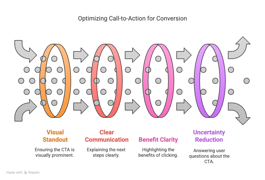
Your CTA is the linchpin of conversion. A good landing page design makes the primary CTA impossible to miss. Whether it’s “Start Free Trial,” “Book Your Demo,” or “Download Now,” the button needs to stand out visually and communicate exactly what happens next.
Use contrasting colors, action verbs, and be crystal clear about the benefit. Good landing pages repeat the CTA multiple times throughout the scroll, especially if the offer is high-value.
The best CTAs reduce uncertainty. They answer: “What will happen when I click?” and “Why should I click now?” Use copy that’s direct, benefit-driven, and time-sensitive.
Leverage Social Proof to Build Trust
Trust accelerates decision-making. One of the most persuasive tools at your disposal is social proof: testimonials, ratings, reviews, case study snippets, and brand logos of companies you’ve worked with.
Visitors don’t want to be the first. Show them they’re in good company. Even a simple “Trusted by 10,000+ users” can significantly increase confidence. Place these elements near CTAs to reinforce action.
Don’t just say you’re great—prove it. Real names, faces, and metrics (like “Increased conversions by 38%”) outperform vague praise every time.
Include Engaging Media (Image or Video)

People process visuals 60,000 times faster than text. That’s why good landing page design always includes high-quality media. Depending on the offer, this could be a short explainer video, a demo walkthrough, or even a simple GIF showing your product in action.
If using video, host it with a fast-loading platform (like Wistia or YouTube embedded properly) and keep it short—90 seconds or less is ideal. Media should support the CTA, not distract from it.
Make sure media is mobile-optimized. Nothing kills trust faster than a video that won’t load or an image that breaks the layout on a phone.
Break Down Key Benefits and Features
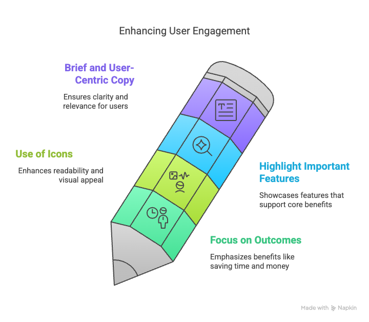
This section is all about clarity. Visitors want to know: “What’s in it for me?” Present your core benefits in a simple, digestible format.
Key benefits:
- Focus on outcomes (save time, make money, eliminate hassle)
- Use icons or bold headers to aid scanning
Features:
- Highlight the most important features that support those benefits
- Keep copy brief and user-centric
This isn’t the place for fluffy adjectives. Be concrete, specific, and make sure each feature directly supports a core benefit.
Showcase Real Customer Testimonials

Testimonials are essential for credibility. But they should be strategic, not just flattering. Choose testimonials that address objections (“I was skeptical at first…”) or speak directly to transformation (“This saved me 10 hours a week”).
Use real names, photos, and titles where possible. If you have video testimonials, even better. Scatter 1–2 powerful ones near key decision points on the page.
Your testimonials should mirror the visitor’s journey. “I didn’t think this would work, but it did” is far more effective than “This was great!”
Answer Questions With an FAQ Section
An FAQ section isn’t filler—it’s conversion fuel. It helps skeptical or hesitant buyers feel reassured. Address real objections: price, timeline, results, support, guarantees.
Each question should have a concise, confident answer. Avoid fluff. If it’s a sales page for a software tool, questions might include: “Do I need coding experience?” or “Is there a free trial?”
Think of the FAQ as a silent salesperson—calming nerves, clarifying details, and closing deals.
Use a Final Call-to-Action to Re-Engage
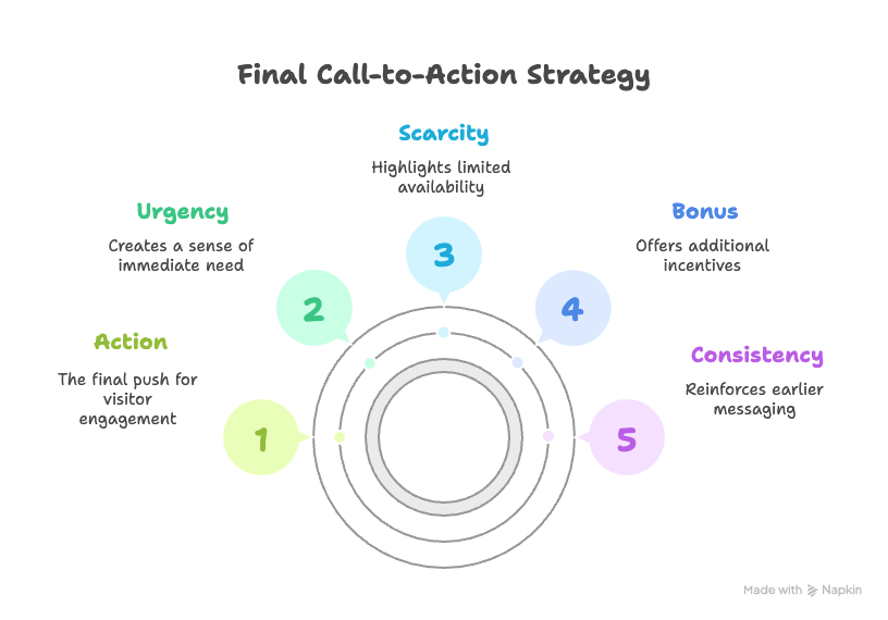
Visitors often need multiple nudges. That’s why good landing page design includes a CTA near the end of the scroll. It’s your chance to re-engage people who read everything and are still on the fence.
Use urgency, scarcity, or a bonus to reinforce action (“Get 2 bonus templates when you sign up today!”). And repeat the same CTA language from earlier to stay consistent.
A closing CTA gives your most thoughtful readers a final push—after you’ve answered all their questions and built trust.
Don’t Forget Legal Pages and Contact Info

Footer elements are easy to overlook—but they matter. Include links to your Privacy Policy, Terms of Use, and any disclaimers required by law. This is especially crucial if you run paid traffic.
Also include a basic contact method—whether it’s an email address, live chat, or a support link. This signals transparency and builds trust.
These links aren’t just legal protection—they’re user signals. A real business is transparent, contactable, and compliant.
Optional Enhancements That Boost Performance

While not required, these elements can give your page an edge:
- Exit-intent popups: Offer a lead magnet or discount before someone leaves.
2. Countdown timers: Add urgency, especially for limited-time offers.
3. Sticky CTAs: Keep a floating button visible on mobile.
4. Scroll progress bar: Shows how far the user is in their journey.
5. Interactive demos: Let users click around or preview your product in real-time.
Use these sparingly—and only if they support your main goal.
Final Thoughts on Good Landing Page Design
A good landing page design isn’t just about looking pretty—it’s about working smart. It blends SEO with structure, copy with psychology, and visuals with trust. Every element should serve one purpose: conversion.
If you want your pages to perform, think like a user and act like a strategist. Remove friction. Build trust. And guide people to the outcome they already want.
When you do it right, your landing page becomes your top salesperson—working 24/7, never asking for a raise, and always closing deals.
Frequently Asked Questions

Q: What’s the biggest mistake people make with landing pages?
A: Trying to do too much. One page, one goal. Keep it focused.
Q: How long should my landing page be?
A: As long as it needs to be to answer objections. For higher-ticket offers, longer is better.
Q: Should I use multiple CTAs?
A: Yes—but they should all drive the same action. Repeat, don’t distract.
Q: Can I use the homepage as a landing page?
A: Not ideal. Homepages serve many purposes. Landing pages serve one.
Q: How do I know if my landing page is working?
A: Track conversions. If you’re under 20% for warm traffic, start testing headline, CTA, and page layout.